Every year, the US Department of Energy and Lawrence Livermore National Lab put together an incredible chart, called a Sankey diagram, which shows all of the energy in the US flowing from source to use. It is one of my favorite graphics, because although it is a bit complicated it is not hard to read, and in just a few minutes it can teach you an impressive amount.
The new US energy Sankey diagram for 2017 was released recently, and I wanted to take the opportunity to look into some of its lessons.
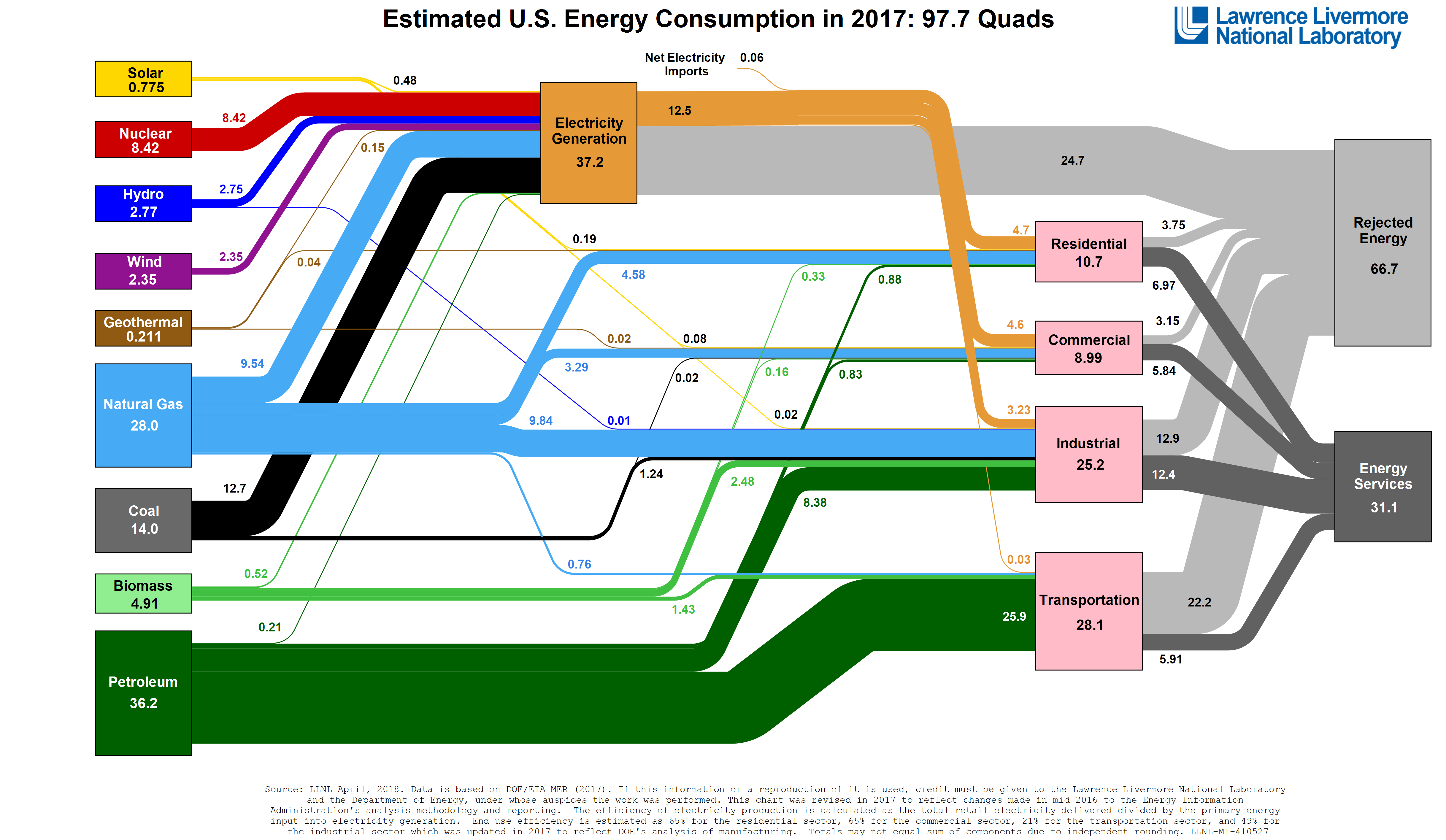
The boxes on the diagram show categories of energy, either sources at the far left, or uses at the right in pink. There is also a special box in the middle for electricity generation, since electricity can be thought of as an intermediate form of energy that conveniently carries it from source to use. The two grey boxes at the right tell us about how efficiently the energy is used. The lines connecting these boxes show how energy is flowing from sources to uses, with the thickness of the line indicating how much. The units are in “Quads”, which is short for “Quadrillion BTUs”. The Quad is a little funny, but it’s a nice country-sized unit (like a kilowatt hour is a “nice human-sized unit”. 1 Quad is about 0.3 trillion kilowatt hours or 293 terawatt hours.)
So where does the energy come from? Mostly fossil fuels! The biggest energy source boxes are petroleum (oil), natural gas, and coal, in that order. The boxes for renewable and carbon-free energy are all much smaller, even when put together. This is a bummer for climate change. Despite the general feeling that there is a revolution happening in solar and wind energy, these remain a pretty tiny fraction of our overall energy use. Most of our carbon-free energy is from nuclear power, which contributes more than the renewable carbon-free energy sources combined.
And where does the energy go? The biggest use box is electricity generation, so a big fraction of our energy is going into power plants, getting converted into electricity, and sent out on the grid. Remember that this is not really a final use though, so it all ends up going somewhere, mostly to our homes and businesses. Of the “final use” boxes, transportation is the biggest, and is fueled almost entirely by petroleum, in the form of gasoline, diesel, and jet fuel. In close second is industry, which uses a pretty diverse mix of energy types. (The industry box is in some ways artificially small, since a lot of the goods used in the US are manufactured elsewhere.) Up next are the considerably smaller residential and commercial boxes, which use mostly electricity, for things like lighting, computers, and appliances, and natural gas, for heating.
The other thing that the Sankey diagram is showing is how efficiently we are using energy. This is shown with the grey lines and boxes with the somewhat cryptic labels “rejected energy” and “energy services”. “Energy services” just means the part of the energy that actually gets used in the way we want. “Rejected energy” is the part that gets wasted doing something other than what we want (usually getting turned into heat) because the device that uses it is inefficient. For example, old-style incandescent light bulbs are very inefficient because they make light by just getting a filament very hot, so almost all of the energy ends up leaving the light bulb as heat and only a small fraction as visible light. LED lights make light directly from electricity, and so are much more efficient.
Most of the inefficiency shown on the Sankey diagram can actually be understood by thinking about losses from heat. Whenever we try to make energy do something useful by first converting it into heat, as is done in fossil-fuel-burning power plants and internal combustion engines in cars, we inevitably end up losing a lot of it. In fact the two boxes with the worst efficiency are transportation, where inefficient combustion engines are the norm, and electricity generation, where fossil fuel power plants dominate. Converting to technologies that skip the step where the energy is converted to heat, like electric vehicles or LED lights, can save a lot of this wasted energy.
LLNL also has diagrams from past years, so it’s interesting to compare and see how things have changed in recent years. Here’s the diagram from 10 years ago:
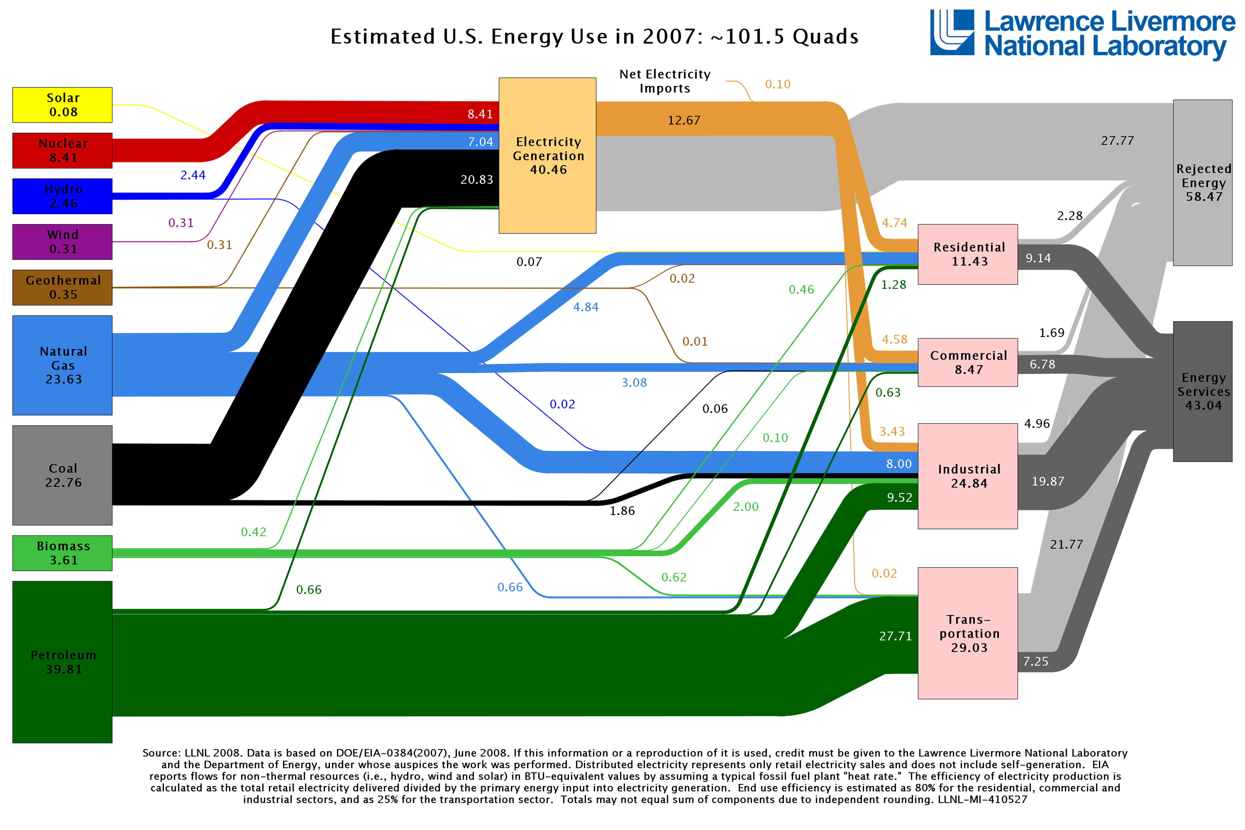
Total energy use has actually gone down slightly, but there were also some important changes in the distribution. One of the biggest changes is that coal use fell by about a third, mostly getting replaced by natural gas. Natural gas became cheap because of the shale gas boom and since natural gas power plants are more efficient and respond faster to changing demand than coal power plants, the electricity industry happily switched over. Also, renewable energy from solar and wind went from being microscopic in 2007 to tiny in 2017, and managed to pick up a little bit of the energy that used to be coming from coal. This is good news, but we still have a very long way to go before renewables will make up a large part of our energy production.
This post was inspired by an article by David Roberts at Vox, which brought my attention to the new diagram and made me want to give my own take.